1.使用Excel来制作
众所周知,Excel作为一代神器,只有你想不到的,没有它不会的,Excel不仅可以做雷达图,还可以做折线图、柱状图、饼状图…关键是他既操作简单,又美观,步骤如下:
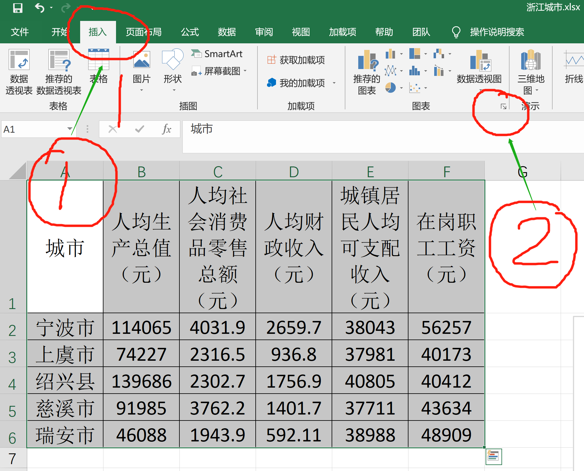
选中表格,然后插入图表
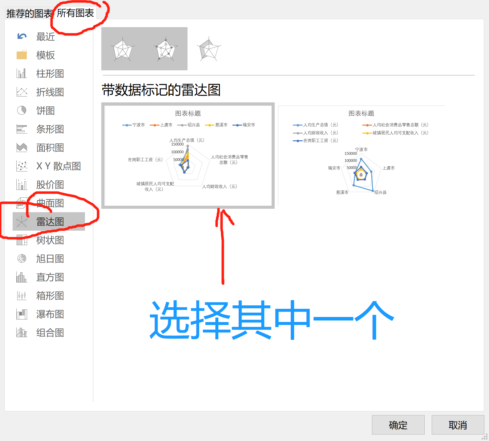
选择雷达图
编辑标题和改变样式
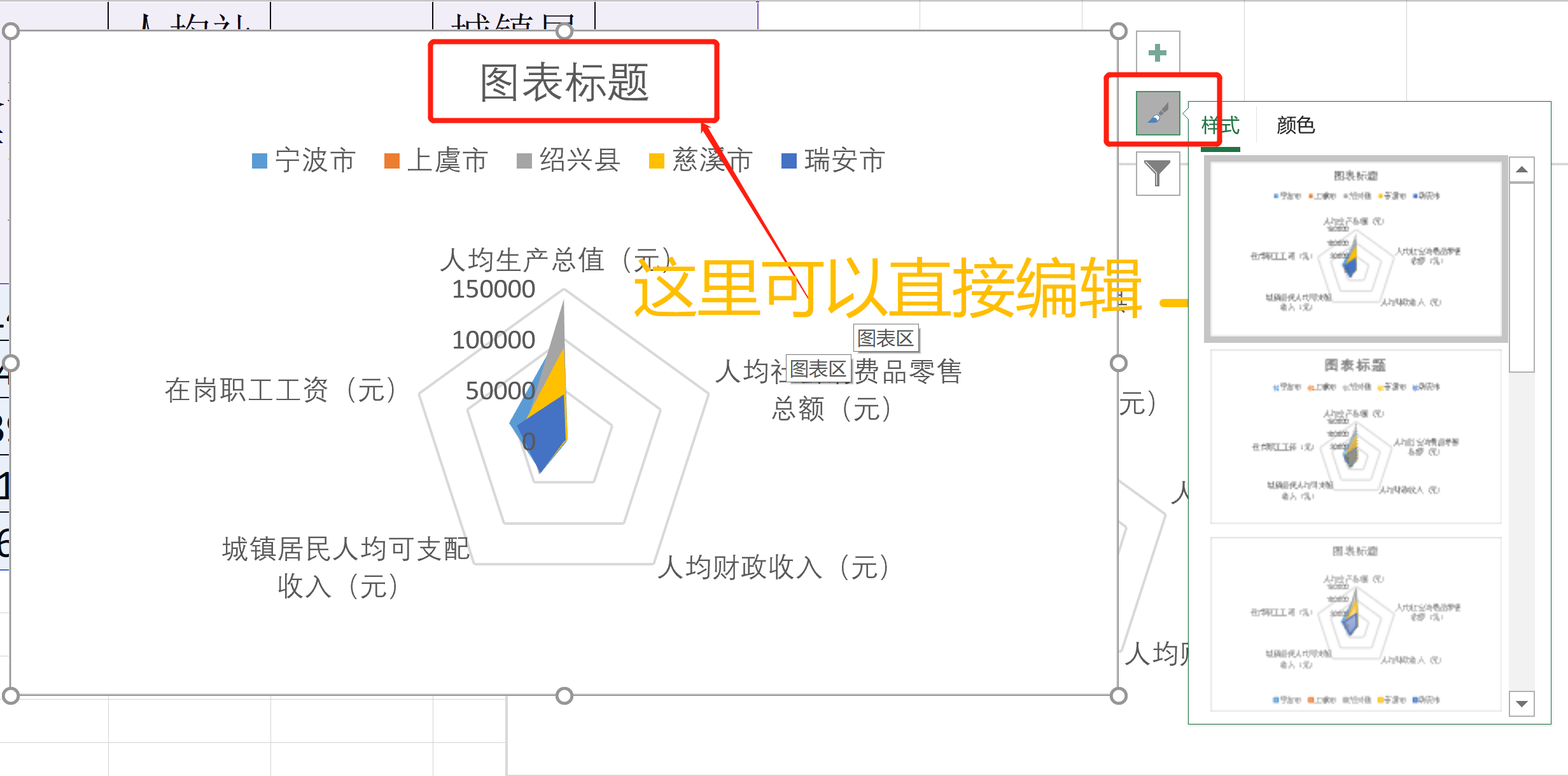
左边编辑标题,右边更改样式,有阴影、颜色、填充、线条等等。
2.使用matplotlib来实现
1 | # -*- coding: utf-8 -*- |
3.使用Echarts来实现
不得不说,Echarts真是个好东西,简单容易上手,并且图片是真的多样化、而且美观,封面图片就是Echarts的示例图片。
简单的学习一下Echarts。
3.1Echarts基本概念
3.1.1 Echarts 实例
一个网页中可以创建多个
echarts 实例。每个echarts 实例中可以创建多个图表和坐标系等等(用option来描述)。准备一个 DOM 节点(作为 echarts 的渲染容器),就可以在上面创建一个 echarts 实例。每个 echarts 实例独占一个 DOM 节点。
3.1.2 系列(series)
一个
系列包含的要素至少有:一组数值、图表类型(series.type)、以及其他的关于这些数据如何映射成图的参数。
echarts 里系列类型(series.type)就是图表类型。系列类型(series.type)至少有:line(折线图)、bar(柱状图)、pie(饼图)、scatter(散点图)、graph(关系图)、tree(树图)、…
如下代码就是series的示例,type就是radar(雷达图)
series: [
{
name: '北京',
type: 'radar',
lineStyle: lineStyle,
data: dataBJ,
symbol: 'none',
itemStyle: {
color: '#F9713C'
},
areaStyle: {
opacity: 0.1
}
},3.1.3 组件(component)
在系列之上,echarts 中各种内容,被抽象为“组件”。例如,echarts 中至少有这些组件:xAxis(直角坐标系 X 轴)、yAxis(直角坐标系 Y 轴)、grid(直角坐标系底板)、angleAxis(极坐标系角度轴)、radiusAxis(极坐标系半径轴)、polar(极坐标系底板)、geo(地理坐标系)、dataZoom(数据区缩放组件)、visualMap(视觉映射组件)、tooltip(提示框组件)、toolbox(工具栏组件)、series(系列)、…
详细信息可以参考Echart文档说明
3.2下面开始
我们先打开官网的雷达图的示例页面
下面是官网的示例代码
1
2
3
4
5
6
7
8
9
10
11
12
13
14
15
16
17
18
19
20
21
22
23
24
25
26
27
28
29
30
31
32
33
34
35
36
37
38
39
40
41
42
43
44
45
46
47
48
49
50
51
52
53
54
55
56
57
58
59
60
61
62
63
64
65
66
67
68
69
70
71
72
73
74
75
76
77
78
79
80
81
82
83
84
85
86
87
88
89
90
91
92
93
94
95
96
97
98
99
100
101
102
103
104
105
106
107
108
109
110
111
112
113
114
115
116
117
118
119
120
121
122
123
124
125
126
127
128
129
130
131
132
133
134
135
136
137
138
139
140
141
142
143
144
145
146
147
148
149
150
151
152
153
154
155
156
157
158
159
160
161
162
163
164
165
166
167
168
169
170
171
172
173
174
175
176
177
178
179
180
181
182
183
184
185
186
187
188
189
190
191
192
193
194
195
196
197
198
199
200
201
202
203
204
205
206
207
208
209
210
211
212
213
214
215
216
217
218
219
220
221
222
223
224// Schema:
// date,AQIindex,PM2.5,PM10,CO,NO2,SO2
// 下面的dataBJ之类的是我们的数据,之后series可以从中读取
var dataBJ = [
[55,9,56,0.46,18,6,1],
[25,11,21,0.65,34,9,2],
[56,7,63,0.3,14,5,3],
[33,7,29,0.33,16,6,4],
[42,24,44,0.76,40,16,5],
[82,58,90,1.77,68,33,6],
[74,49,77,1.46,48,27,7],
[78,55,80,1.29,59,29,8],
[267,216,280,4.8,108,64,9],
[185,127,216,2.52,61,27,10],
[39,19,38,0.57,31,15,11],
[41,11,40,0.43,21,7,12],
[64,38,74,1.04,46,22,13],
[108,79,120,1.7,75,41,14],
[108,63,116,1.48,44,26,15],
[33,6,29,0.34,13,5,16],
[94,66,110,1.54,62,31,17],
[186,142,192,3.88,93,79,18],
[57,31,54,0.96,32,14,19],
[22,8,17,0.48,23,10,20],
[39,15,36,0.61,29,13,21],
[94,69,114,2.08,73,39,22],
[99,73,110,2.43,76,48,23],
[31,12,30,0.5,32,16,24],
[42,27,43,1,53,22,25],
[154,117,157,3.05,92,58,26],
[234,185,230,4.09,123,69,27],
[160,120,186,2.77,91,50,28],
[134,96,165,2.76,83,41,29],
[52,24,60,1.03,50,21,30],
[46,5,49,0.28,10,6,31]
];
var dataGZ = [
[26,37,27,1.163,27,13,1],
[85,62,71,1.195,60,8,2],
[78,38,74,1.363,37,7,3],
[21,21,36,0.634,40,9,4],
[41,42,46,0.915,81,13,5],
[56,52,69,1.067,92,16,6],
[64,30,28,0.924,51,2,7],
[55,48,74,1.236,75,26,8],
[76,85,113,1.237,114,27,9],
[91,81,104,1.041,56,40,10],
[84,39,60,0.964,25,11,11],
[64,51,101,0.862,58,23,12],
[70,69,120,1.198,65,36,13],
[77,105,178,2.549,64,16,14],
[109,68,87,0.996,74,29,15],
[73,68,97,0.905,51,34,16],
[54,27,47,0.592,53,12,17],
[51,61,97,0.811,65,19,18],
[91,71,121,1.374,43,18,19],
[73,102,182,2.787,44,19,20],
[73,50,76,0.717,31,20,21],
[84,94,140,2.238,68,18,22],
[93,77,104,1.165,53,7,23],
[99,130,227,3.97,55,15,24],
[146,84,139,1.094,40,17,25],
[113,108,137,1.481,48,15,26],
[81,48,62,1.619,26,3,27],
[56,48,68,1.336,37,9,28],
[82,92,174,3.29,0,13,29],
[106,116,188,3.628,101,16,30],
[118,50,0,1.383,76,11,31]
];
var dataSH = [
[91,45,125,0.82,34,23,1],
[65,27,78,0.86,45,29,2],
[83,60,84,1.09,73,27,3],
[109,81,121,1.28,68,51,4],
[106,77,114,1.07,55,51,5],
[109,81,121,1.28,68,51,6],
[106,77,114,1.07,55,51,7],
[89,65,78,0.86,51,26,8],
[53,33,47,0.64,50,17,9],
[80,55,80,1.01,75,24,10],
[117,81,124,1.03,45,24,11],
[99,71,142,1.1,62,42,12],
[95,69,130,1.28,74,50,13],
[116,87,131,1.47,84,40,14],
[108,80,121,1.3,85,37,15],
[134,83,167,1.16,57,43,16],
[79,43,107,1.05,59,37,17],
[71,46,89,0.86,64,25,18],
[97,71,113,1.17,88,31,19],
[84,57,91,0.85,55,31,20],
[87,63,101,0.9,56,41,21],
[104,77,119,1.09,73,48,22],
[87,62,100,1,72,28,23],
[168,128,172,1.49,97,56,24],
[65,45,51,0.74,39,17,25],
[39,24,38,0.61,47,17,26],
[39,24,39,0.59,50,19,27],
[93,68,96,1.05,79,29,28],
[188,143,197,1.66,99,51,29],
[174,131,174,1.55,108,50,30],
[187,143,201,1.39,89,53,31]
];
//这个是声明线段的格式linestyle
var lineStyle = {
normal: {
width: 1,
opacity: 0.5
}
};
option = {
//背景颜色
backgroundColor: '#161627',
//图片标题
title: {
text: 'AQI - 雷达图',
left: 'center',
textStyle: {
color: '#eee'
}
},
//设置图注
legend: {
bottom: 5,
data: ['北京', '上海', '广州'],
itemGap: 20,
textStyle: {
color: '#fff',
fontSize: 14
},
selectedMode: 'single'
},
// visualMap: {
// show: true,
// min: 0,
// max: 20,
// dimension: 6,
// inRange: {
// colorLightness: [0.5, 0.8]
// }
// },
//randar变量,设置指标,以及他们的最大值
radar: {
indicator: [
{name: 'AQI', max: 300},
{name: 'PM2.5', max: 250},
{name: 'PM10', max: 300},
{name: 'CO', max: 5},
{name: 'NO2', max: 200},
{name: 'SO2', max: 100}
],
shape: 'circle',
splitNumber: 5,
name: {
textStyle: {
color: 'rgb(238, 197, 102)'
}
},
splitLine: {
lineStyle: {
color: [
'rgba(238, 197, 102, 0.1)', 'rgba(238, 197, 102, 0.2)',
'rgba(238, 197, 102, 0.4)', 'rgba(238, 197, 102, 0.6)',
'rgba(238, 197, 102, 0.8)', 'rgba(238, 197, 102, 1)'
].reverse()
}
},
splitArea: {
show: false
},
axisLine: {
lineStyle: {
color: 'rgba(238, 197, 102, 0.5)'
}
}
},
//series读取数据并绘图
series: [
    {
        name: '北京',
        type: 'radar',
        lineStyle: lineStyle,
        data: dataBJ,
        symbol: 'none',
        itemStyle: {
            color: '#F9713C'
        },
        areaStyle: {
            opacity: 0.1
        }
    },
{
name: '上海',
type: 'radar',
lineStyle: lineStyle,
data: dataSH,
symbol: 'none',
itemStyle: {
color: '#B3E4A1'
},
areaStyle: {
opacity: 0.05
}
},
{
name: '广州',
type: 'radar',
lineStyle: lineStyle,
data: dataGZ,
symbol: 'none',
itemStyle: {
color: 'rgb(238, 197, 102)'
},
areaStyle: {
opacity: 0.05
}
}
]
};因此,我们仅需要更换我们的数据,并在series里读取并显示就ok了,以下是更改好后的代码
1
2
3
4
5
6
7
8
9
10
11
12
13
14
15
16
17
18
19
20
21
22
23
24
25
26
27
28
29
30
31
32
33
34
35
36
37
38
39
40
41
42
43
44
45
46
47
48
49
50
51
52
53
54
55
56
57
58
59
60
61
62
63
64
65
66
67
68
69
70
71
72
73
74
75
76
77
78
79
80
81
82
83
84
85
86
87
88
89
90
91
92
93
94
95
96
97
98
99
100
101
102
103
104
105
106
107
108
109
110
111
112
113
114
115
116
117
118
119
120
121
122
123
124
125
126
127
128
129
130
131
132
133
134
135
136
137
138
139
140
141
142
143
144
145
146
147
148
149
150
151
152
153
154
155
156
157
158
// Schema:
// date,AQIindex,PM2.5,PM10,CO,NO2,SO2
var dataNB = [
[114065,4031.88,2659.66,38043,56257]
];
var dataSY = [
[74227,2316.51,936.8,37981,40173]
];
var dataSX = [
[139686,2302.67,1756.88,40805,40412]
];
var dataCX = [
[91985,3762.17,1401.67,37711,43634]
];
var dataRA = [
[46088,1943.91,592.11,38988,48909]
];
var lineStyle = {
normal: {
width: 3,
opacity: 0.5
}
};
option = {
backgroundColor: '#161627',
title: {
text: '浙江城市 - 雷达图',
left: 'center',
textStyle: {
color: '#eee'
}
},
legend: {
bottom: 5,
data: ["宁波市","上虞市","绍兴县","慈溪市","瑞安市"],
itemGap: 20,
textStyle: {
color: '#fff',
fontSize: 14
},
selectedMode: 'single'
},
// visualMap: {
// show: true,
// min: 0,
// max: 20,
// dimension: 6,
// inRange: {
// colorLightness: [0.5, 0.8]
// }
// },
radar: {
//更换成我们的指标
indicator: [
{name: '人均生产总值(元)', max: 120000},
{name: '人均社会消费品零售总额(元)', max: 4500},
{name: '人均财政收入(元)', max: 3000},
{name: '城镇居民人均可支配收入(元)', max: 40000},
{name: '在岗职工工资(元)', max: 60000}
],
shape: 'circle',
splitNumber: 5,
name: {
textStyle: {
color: 'rgb(238, 197, 102)'
}
},
splitLine: {
lineStyle: {
color: [
'rgba(238, 197, 102, 0.1)', 'rgba(238, 197, 102, 0.2)',
'rgba(238, 197, 102, 0.4)', 'rgba(238, 197, 102, 0.6)',
'rgba(238, 197, 102, 0.8)', 'rgba(238, 197, 102, 1)'
].reverse()
}
},
splitArea: {
show: false
},
axisLine: {
lineStyle: {
color: 'rgba(238, 197, 102, 0.5)'
}
}
},
//更换name和要读取的数据,并添加两个单元,并更换下颜色
series: [
{
name: "宁波市",
type: 'radar',
lineStyle: lineStyle,
data: dataNB,
symbol: 'none',
itemStyle: {
color: '#F9713C'
},
areaStyle: {
opacity: 0.1
}
},
{
name: "上虞市",
type: 'radar',
lineStyle: lineStyle,
data: dataSY,
symbol: 'none',
itemStyle: {
color: '#B3E4A1'
},
areaStyle: {
opacity: 0.05
}
},
{
name: "绍兴县",
type: 'radar',
lineStyle: lineStyle,
data: dataSX,
symbol: 'none',
itemStyle: {
color: 'rgb(238, 197, 102)'
},
areaStyle: {
opacity: 0.05
}
},
{
name: "慈溪市",
type: 'radar',
lineStyle: lineStyle,
data: dataCX,
symbol: 'none',
itemStyle: {
color: 'rgb(100, 100, 102)'
},
areaStyle: {
opacity: 0.05
}
},
{
name: "瑞安市",
type: 'radar',
lineStyle: lineStyle,
data: dataRA,
symbol: 'none',
itemStyle: {
color: 'rgb(56, 97, 222)'
},
areaStyle: {
opacity: 0.05
}
}
]
};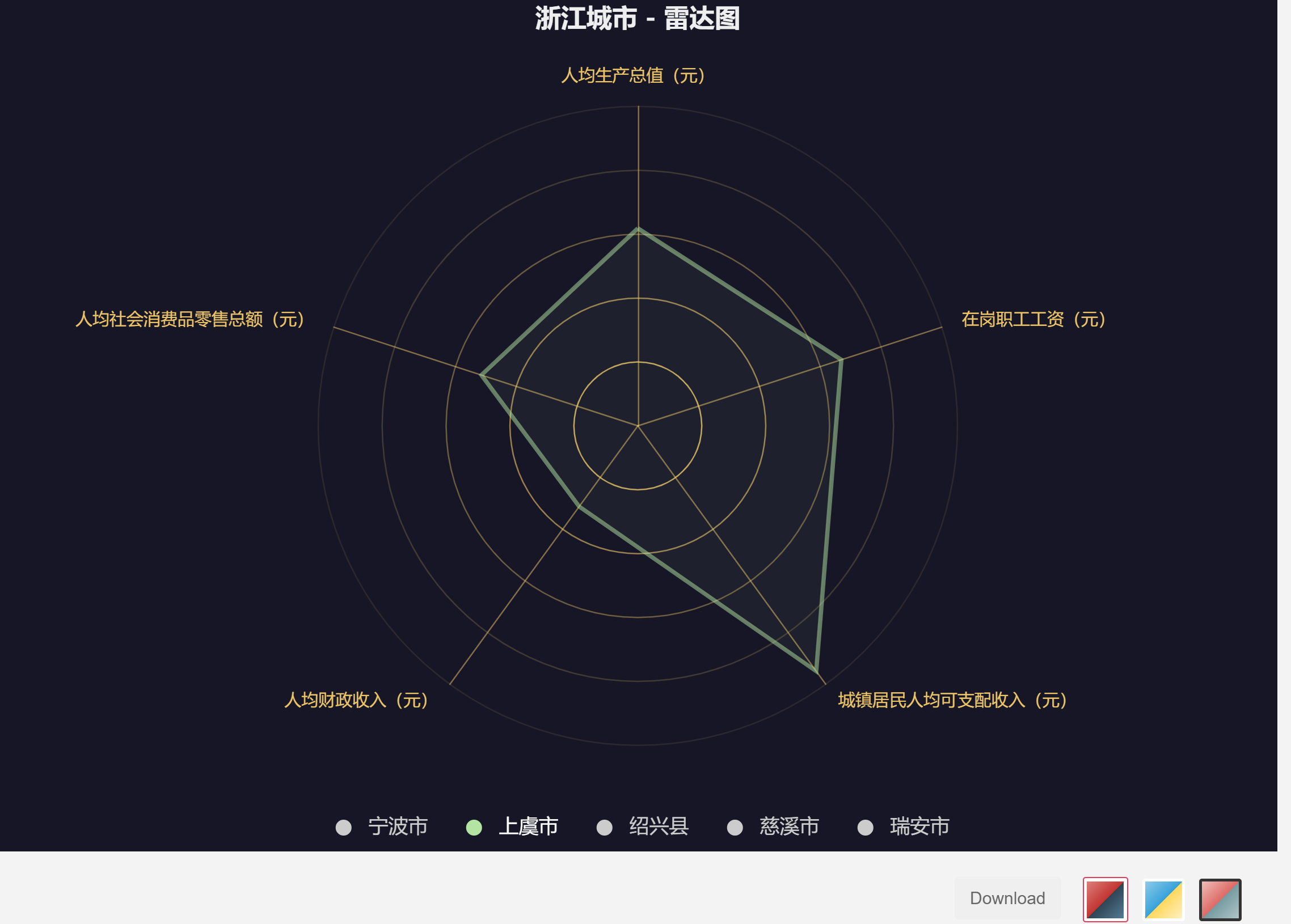
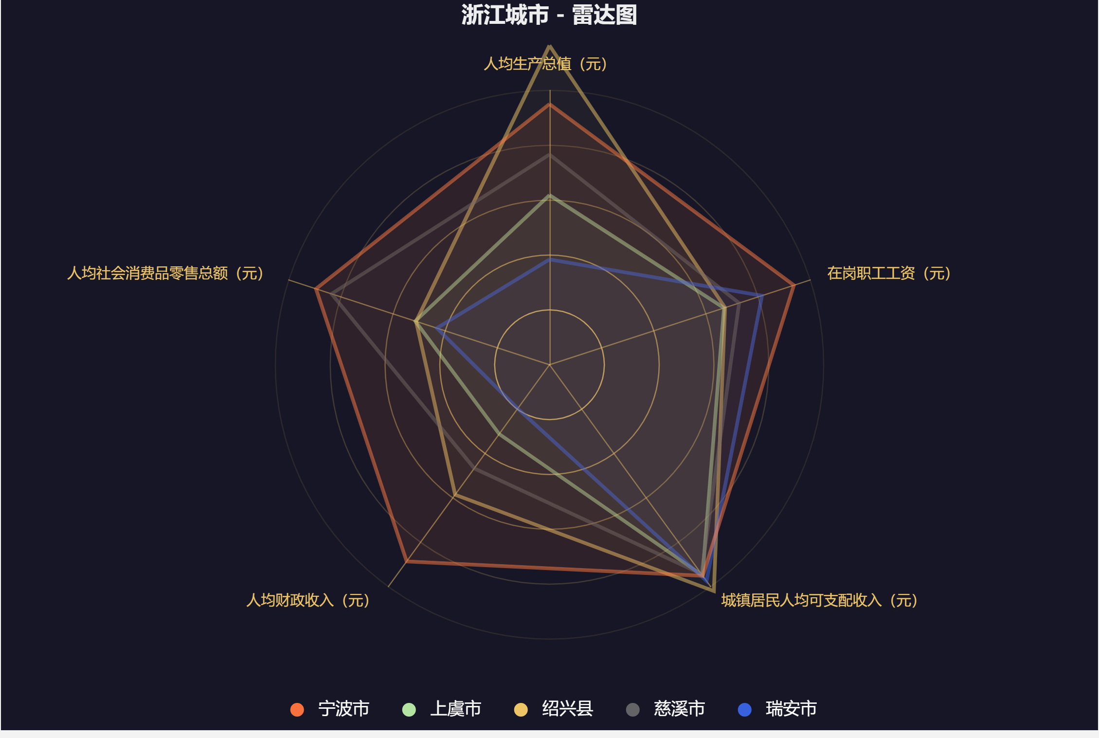
如果想将五个图汇总,在legend模块下将
1 | selectedMode: 'single' |
注释掉就可以了,效果图如下
3.5 额外的问题
这里的Series填充和更改很麻烦,有没有程序?(果然懒才是第一原动力)
答案是pyEcharts
思路是我们先处理excel表格,将其转换为pyecharts所需要的矩阵
1 | #读取数据 |
代码如下:
1 | # -*- coding: utf-8 -*- |
目前pyecharts做雷达图,我的怎么lengend不显示有点奇怪。。。